

Quick Answer
Landing page UI components are the building blocks that make up a high-converting page: hero sections, social proof, CTAs, feature sections, pricing tables, and more. The best landing pages don't reinvent these components-they master the structure, copy, and visual hierarchy that make each one work. You can extract proven designs from successful SaaS sites and adapt them to your own landing page, saving weeks of design iteration.
What Are Landing Page UI Components (And Why They Matter)
Landing page UI components are the modular sections that work together to guide a visitor from awareness to action. Each component serves a specific purpose: the hero grabs attention, social proof builds trust, features explain value, and CTAs drive conversion.
The reason this matters is simple: most high-converting landing pages follow a predictable structure. They don't rely on novelty or surprise. Instead, they use proven component patterns that have been tested across thousands of pages.
When you understand these components, you can:
- Identify what's working on competitor landing pages
- Reuse patterns without starting from scratch
- Make faster design decisions backed by data
- Build a personal component library for future projects
The best part? You don't need to design these from scratch. Proven SaaS landing pages already have the answers. You just need to know how to extract and adapt them.
The Core Components Every High-Converting Landing Page Needs
Not every landing page needs every component. But the most effective ones follow a consistent hierarchy:
- Hero Section - Your first impression (headline, subheadline, CTA, visual)
- Social Proof & Stats - Build credibility fast (logos, testimonials, metrics)
- Problem/Solution - Validate the visitor's pain point
- Features Section - Communicate value clearly (usually 3-6 key features)
- CTA & Forms - The conversion engine (email signup, trial, demo request)
- Pricing & Comparison - Remove purchase friction (if applicable)
- FAQ or Objection Handling - Address final doubts
- Final CTA - Reinforce the ask before they leave
A well-designed stats section is concise, visually attractive, and lists the most impressive and meaningful data. This applies to every component: clarity and visual hierarchy matter more than complexity.
Hero Section: Your First Impression
The hero is where most landing pages win or lose. You have roughly 3 seconds to communicate:
- What you do
- Who it's for
- Why they should care
A strong hero includes:
- Headline: Clear, benefit-focused, jargon-free
- Subheadline: Expands on the headline with specificity
- Visual: Screenshot, illustration, or video that reinforces the message
- Primary CTA: One clear action (sign up, start free trial, watch demo)
The mistake most teams make is trying to explain everything in the hero. Keep the messaging clear and concise, avoiding jargon or complex language. Your hero should answer one question: "Is this for me?"
Example: Instead of "AI-powered workflow automation platform," try "Save 5 hours a week on repetitive tasks-no coding required."
Social Proof & Stats Sections: Building Credibility Fast
Trust is the second barrier after relevance. Social proof components remove doubt by showing that others have already made the decision.
Effective social proof includes:
- Customer logos - Recognizable brands using your product
- Testimonials - Short, specific quotes (not generic praise)
- Stats - Key metrics like "150+ apps successfully delivered" or "9 experts on the core team" that establish scale and credibility
- Case study snippets - Brief results (e.g., "Reduced onboarding time by 40%")
The stats section is particularly powerful because it uses numbers to prove impact. Instead of saying "many customers," show "2,500+ teams." Instead of "trusted by companies," show "trusted by Slack, Figma, and Notion."

A typical social proof flow: logos establish familiarity, stats prove scale, testimonials add personality.
CTA Buttons & Forms: The Conversion Engine
Your CTA is where intent becomes action. The most effective CTAs are:
- Action-oriented: "Start Free Trial" beats "Submit"
- Low-friction: Ask for email first, not phone + company + budget
- Visually distinct: High contrast, clear hierarchy
- Repeated: Hero CTA, mid-page CTA, bottom CTA (same message, different context)
Forms should follow the same principle: ask only what you need. A single email field converts better than a 5-field form, even if you lose some data upfront.
Button color matters less than contrast. What matters is that your CTA stands out from the rest of the page and feels clickable.
Feature Sections: Communicating Value Clearly
Features sections explain how your product solves the problem introduced earlier. The best feature sections:
- Show 3-6 features (not 20)
- Lead with benefit, then explain how
- Use icons or small visuals for scannability
- Include a short description (1-2 sentences max)
Structure each feature like this:
- Icon or visual - Immediate recognition
- Feature name - Benefit-focused (not technical)
- Description - One sentence explaining the outcome
Example:
- ❌ "Advanced API integration"
- ✅ "Connect any tool in minutes-no developer needed"
Pricing & Comparison Tables: Removing Purchase Friction
If you're selling, pricing transparency removes a major objection. Effective pricing sections:
- Show clear tiers (Starter, Pro, Enterprise)
- Highlight the recommended tier visually
- List what's included at each level
- Make the comparison scannable (use checkmarks, not prose)
Comparison tables work best when they answer: "Which plan is right for me?" Not every feature needs to be listed-only the ones that differentiate tiers.
| Feature | Starter | Pro | Enterprise |
|---|---|---|---|
| Up to 10 projects | ✓ | ✓ | ✓ |
| Team collaboration | ✓ | ✓ | |
| Custom integrations | ✓ | ||
| Dedicated support | ✓ |
How to Extract & Reuse Landing Page Components
This is where the real speed comes in. Instead of designing from scratch, you can extract proven components from high-converting SaaS landing pages and adapt them to your own.
The process:
- Find a reference page - Identify a SaaS company in your space with a landing page you admire
- Inspect the component - Use browser DevTools or a capture tool to extract the HTML and CSS
- Adapt the structure - Keep the layout and hierarchy, swap in your own copy and visuals
- Test and iterate - A/B test headlines, CTAs, and visual hierarchy
The key is understanding why a component works, not just copying it blindly. A hero section that works for a project management tool might need adjustment for a design tool, but the underlying structure (headline, subheadline, visual, CTA) remains the same.

Extract → Adapt → Test → Iterate. This workflow accelerates landing page development significantly.
Common Component Mistakes That Kill Conversions
Even with the right components, small mistakes can tank conversion rates:
- Too many CTAs - Visitors get confused about what to do next
- Weak headlines - Unclear value proposition or too much jargon
- Missing social proof - No reason to trust you over competitors
- Cluttered feature sections - Too many features, no clear priority
- Slow-loading visuals - Hero images that take 3+ seconds to load
- Misaligned messaging - Ad copy doesn't match landing page headline
- No mobile optimization - Components that look good on desktop but break on mobile
The most common mistake? Trying to explain everything. Conversion remains stuck when teams focus on changing button colors instead of addressing fundamental messaging and structure. Start with clarity, then optimize.
Building Your Own Component Library from Proven Designs
Once you've extracted a few components, you can build a personal library for future projects. This saves enormous time on subsequent landing pages.
A basic component library includes:
- Hero variations - Different layouts for different value props
- Social proof templates - Logo grids, testimonial cards, stat blocks
- Feature sections - 3-column, 2-column, alternating layouts
- CTA variations - Different button styles, form layouts
- Pricing tables - 2-tier, 3-tier, comparison formats
Store these as reusable templates (Figma, HTML/CSS, or component code). When you need to build a new landing page, you're not starting at zero-you're remixing proven patterns.
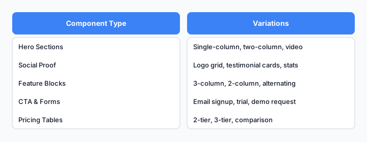
A well-organized component library: organized by type, with variations for different use cases.
The Faster Path Forward
The landing pages that convert best aren't the most original-they're the most intentional. Every component serves a purpose. Every section builds on the last.
You don't need to reinvent landing page design. You need to understand the components that work, extract them from proven sources, and adapt them to your specific audience and offer.
Start by auditing three high-converting landing pages in your space. Note the structure, the copy, the visual hierarchy. Then extract one component and adapt it to your own page. Test it. Iterate.
That's how you build landing pages that actually convert.